Tips for Brochure Printing

When was the last time you went into a showroom to choose the kitchen or automobile you wanted next? It’s likely that you were given a brochure including comprehensive details and eye-catching pictures of the product that might draw your attention. For many years, brochures have been an essential component of marketing, and their continued significance is clearly warranted. With their affordable production and noticeable appearance brochures will continue to play a significant role in the promotion of goods and services for years to come.
Some people, however, think that maximising the amount of content and graphics on a page increases its value. This kind of writing discourages many potential readers and can make for an unpleasant reading experience.
“So, what qualities go into creating a successful brochure?”
A few basic guidelines might help you make the most of the space in your brochure and get your point across to readers.
Make your Brochure easy
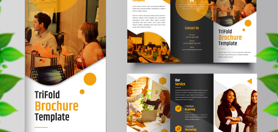
The size of a brochure typically determines how much room is available for your content. This restriction does not, however, mean that all available space must be filled with text and images. Start by concentrating on your brochure’s main goal. Do you want to inform buyers about a recently released product? Or maybe you possess a wealth of knowledge to assist them in making wise choices? Whatever your objective is, just be sure the information you provide is clear and pertinent to it.
Correct Resolution of Image

We frequently receive complaints from clients about their brochures having the wrong image resolution. When it comes to printing, crisp graphics and photos are crucial because one bad image may ruin the entire publication. The gold standard for print quality is 300 DPI (dots per inch), which guarantees crisp, clear graphics. Pixelation and an unattractive “blocky” appearance can arise from using bitmap pictures with low DPI. If your company prides itself for offering high-end products and services, mediocre images could damage your reputation.
It is highly recommended that you verify the DPI of each image in your brochure prior to submitting your files for printing. Sustaining this vital component of picture quality can greatly improve the printed goods’ overall appeal and professionalism.
Which is your font?

Your brochure’s font selection isn’t merely a matter of taste. Typography is an art form, but for those who aren’t familiar with the differences between sans serifs and Comic Sans (please, never use Comic Sans for something official), here are some guidelines for choosing the appropriate font:
- Consistency in Font Family: To keep a unified appearance, stick to a consistent font family. Make sure your style transitions flow in harmony to save the reader from becoming confused.
- Font Size: Use a font size of at least 12 points. Slight reductions may compromise readability, particularly when printed.
Avoid using all black as your default colour scheme. To achieve sharp text, use exact colour values such as C-0/M-0/Y-0/K-100 and make sure that only the black plate is used during printing.
Get, set, and print your brochure
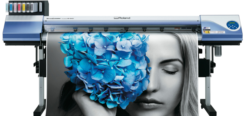
Making sure your PDF file is print-ready is the last step before printing your finished brochure. Before sending your artwork files for printing, we strongly advise you to check the technical specifications for all products—brochures included.
In order to facilitate manufacturing, make sure the pagination runs correctly from the front cover to the rear cover, so as to be read by the printers correctly. Make sure the file is password-free and that all fonts are embedded into the PDF.
After carefully reviewing and checking your file is prepared to be sent for printing. Nevertheless, if you’re not completely satisfied with your design or grammar, it’s best to get your file checked by an expert before moving any further. To search which artwork service best suits your requirements, do visit our site for more information.
Also Read: Promote Your Business- 5 Reasons to Choose Leaflets as Part of Your Marketing Campaign

