Top 5 Design Tips to Help Your Small Irish Businesses Stand Out


Making a lasting impression on your clients in today’s cutthroat market is essential, and differentiating yourself from your rivals is more important than ever. It is crucial to have a strong and consistent brand identity because there are so many companies competing for customers’ attention.
These days, pictures and images rule the market. Clients will notice your small business based on how it appears to them. Customers will come to you because of your brands, which again depends on visual experience. A skillfully created design not only effectively conveys the spirit of your company but also aids in leaving a lasting impression on your target market. This is especially important for Irish small businesses because establishing a solid customer base is essential to long-term survival. To make your small business stand out among the competitors you should learn the Top 5 Design Tips to Help Your Small Irish Businesses Stand Out.
Top 5 Design Tips to Help Your Small Irish Businesses Stand Out
So, this article reviews the Top 5 Design Tips to Help Your Small Irish Businesses stand out, if you are eager to learn then this blog is for you. Do follow these tips in your small business, you may say results within sometimes.
1. Create a Memorable Logo
Your logo is the identity of your brand. It is often the first thing people associate with your small business, therefore making a strong and lasting impression in the minds of your customer is very important. Just think of some famous brand. The first thing you will see is the logo, think of Puma or Nike. Thus, it is very important for any small business to create a memorable logo to stand out in the market.
When designing your logo, consider the following:
- Ensure simplicity: Simple, minimalist designs are simpler to recall and identify.
- Be distinct: Avoiding clichés or unoriginal graphics will help your logo stand out from the crowd.
- Describe your brand’s personality: Your company’s core beliefs and personality should be conveyed through your logo.
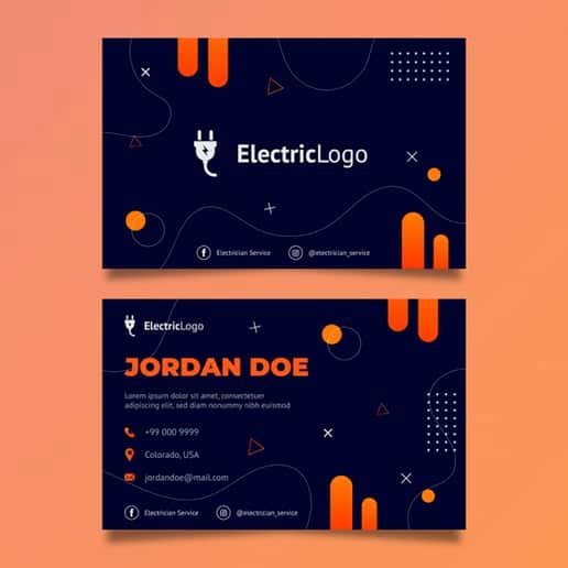
- Versatility: Make sure that your logo looks great in different sizes and on different media, from business cards to billboards.
2. Choose the Right Color Scheme
Since colour can affect how people feel, how a space feels, and how people perceive your brand, colour use in design is crucial. Making a strong and cohesive brand identity for your business requires selecting the right colour scheme. To ensure that your choice of colours resonates with your target audience and enhances how your brand is perceived, consider the following criteria when selecting the colour scheme:
- Consider your target audience: The cultural connotations of certain colours may differ. For instance, the colour red can signify both danger and love. Consequently, it is imperative that you comprehend your target market. Therefore, be certain that you will consider the preferences of your Irish clients. For instance, incorporate parts of the country’s three official colors—green, white, and orange—or draw inspiration from its numerous beautiful vistas and rich cultural history.
- Be Consistent: Consistently utilise the same colour palette in all of your marketing materials to create a united company identity.
- To avoid confusing your consumers and diluting the message of your brand, keep your usage of colour to two or three primary hues. Starbucks is a good illustration. Green and white are the only hues they employ.
3. Harness the Power of Typography
Typography is a crucial component of design that has a big impact on the look and efficacy of your marketing materials. Your choice of typefaces is essential for expressing the individuality of your business and making sure that your message is delivered simply and successfully. Take into account the following recommendations to maximise the potential of typography for your Irish small business:
- Legibility: Prioritise selecting fonts that are simple to read and understand, especially at small sizes or from a distance. Avoid fonts with excessive ornamentation or complexity as they may make text harder to read.
- Reflect the personality of your brand: Different typefaces can elicit a variety of feelings and associations that can be used to communicate the character and principles of your brand. For instance, whereas a traditional serif font might imply stability and dependability, a contemporary sans-serif typeface might signify innovation and professionalism. Choose typefaces with care to ensure they fit the personality of your brand and appeal to your target market. Additionally, you can alter the typography to suit your brand.
- Limit the number of fonts: To preserve a unified and professional appearance, limit fonts to two or three complementary styles.
- Limit the number of typefaces you use in your designs to two or three complementing styles to retain a unified and professional appearance. Generally speaking, it’s a good idea to use a different font for body text and headings and save the third option for accents or special events. A design’s overall impact might be weakened by the use of too many different fonts, which can create visual confusion.
- Establish hierarchy and contrast: You may help create order and contrast within your designs by utilising various fonts, weights, and sizes.
4. Utilise Whitespace and Layout
The spaces between design elements like text, photos, and graphics are referred to as whitespace or negative space. To create aesthetically appealing, well-organized designs that are simple for your audience to understand and engage with, effective use of whitespace and layout is essential. Consider the following ideas to effectively use whitespace and layout in the marketing materials for your Irish small business:
- A perfect blend of text and images should be present in your marketing materials to avoid overwhelming or confusing the reader.
- Use grids to help you build an organised layout that directs the eye and makes it simple to follow your content.
- Accept whitespace: Don’t be afraid to leave some spaces empty, as this can help highlight your most crucial material and evoke a sense of serenity and refinement.
- Establish a visual hierarchy in your designs by using whitespace and layout to do so. This will help the viewer’s eye move logically and intuitively across your material.
5. Make Your Design Accessible

Design accessibility ensures that all members of your target audience, including those with visual impairments or other disabilities, can readily understand and interact with your marketing materials. Making your designs accessible not only shows your dedication to diversity but also increases the pool of possible customers for your business. Take into account the following recommendations when designing accessible content for your Irish small business:
- Use strong contrast to make text and backdrop colours stand out from one another for easier reading. For those with low vision or colour vision issues, this is especially crucial. Avoid using colours with identical brightness levels for both the text and background, and choose the dark text on a light backdrop or vice versa.
- Talk in plain, basic language: Avoid using jargon or highly technical vocabulary in your communication; keep it simple and easy to grasp.
- To ensure that all images and graphics in digital material have alternate (alt) text descriptions, make sure to include it while developing the content. Screen reader users and those with visual impairments can access visual elements by using alt text, which gives a textual explanation of them.
- Design your website or app so that it can be readily browsed with just a keyboard, as certain people may not be able to use a mouse or touchscreen. This is especially important for digital material. Offering obvious focus indications, sensible tab ordering, keyboard-accessible menus, and interactive features are a few examples of how to do this.
- Test your designs: To detect any possible accessibility concerns and gain input, test your designs with a variety of users, including people who have impairments.
- You may develop a distinctive and memorable brand that distinguishes your Irish small business from the competition by applying these design suggestions to your company’s marketing materials. In addition to appealing to a wide audience, emphasising simplicity, consistency, and accessibility in your designs will also help to develop a sense of community.
Also Read: A4 Duplicate Invoice Books for Small Business Owners
Conclusion:
You may develop a distinctive and memorable brand that distinguishes your Irish small business from the competition by applying these design suggestions into your company’s marketing materials. You’ll not only appeal to a wide audience by emphasising simplicity, consistency, and accessibility in your designs, but you’ll also cultivate a sense of trust and professionalism that will persuade potential clients to choose your company over rivals.

