


The most crucial element to consider in print marketing is the message. The message must have the desired effect on your target audience. However, no matter how persuasive or compelling your message is, it can be easily missed if printed on a plain, white background. Here is when the significance of colour in print marketing really shines through. They can attract attention to your advertisement, elicit diverse feelings from viewers, and entice them to engage with your business.
In this guide, we’ll delve into the fundamentals of colour theory to help you make sense of the meaning behind various hues and learn how to employ them in your advertisements.
Basics of colour theory
Science and art are combined to create colour theory. It contains guidelines and rules for utilising colour schemes to produce striking visual effects.
The colour wheel
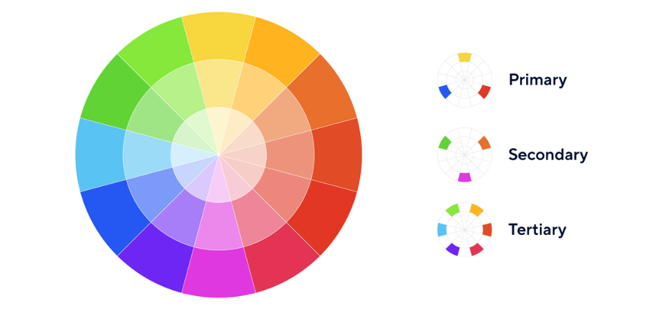
The colour wheel serves as the foundation of colour theory.
Fun fact: Sir Issac Newton created it in the seventeenth century following a number of findings pertaining to the colour spectrum.
There are three colour categories on the colour wheel:
- Primary
- Secondary
- Tertiary
Following that, the colours in these categories are split into two sections:
- Warm
- Cool
It’s thought that warmer colours, like red, orange, and yellow, invoke energy when observed. Conversely, cooler hues like blues and purples are said to be calming to the eyes.
Colour harmonies can be produced by combining colours that are near to one another on the colour wheel. On the other hand, complementary colours, which are those on opposing ends of the spectrum, are useful for bringing contrasts into your design.
Primary, secondary and tertiary colours
In the standard color wheel, colors are typically divided into three main groups. These are the following:
Primary colours are those that cannot be made by combining different shades:
- Red
- Yellow
- Blue
Secondary colours are created by combining two primary colours:
- Purple
- Orange
- Green
Tertiary colours are produced by combining one primary and one secondary colour:
- Orange and red (vermilion)
- Orange and yellow (Amber)
- Green and yellow (Chartreuse)
- Green and blue (Teal)
- Violet and blue (Violet)
- Purple and red (magenta
Colour models

What relevance does colour theory have for print marketing and digital design now?
Utilising the two most popular kinds of colour models available:
- RGB
- CMYK
Red, green, and blue are combined to form various tints that make up the RGB colour model. It is typically utilised in digital designs, such as those for webpages, mobile apps, and television advertisements.
The common model for printed designs is CMYK. It stands for the colours found on an ink cartridge: Cyan, Magenta, Yellow, and Key (Black). The current shade of your printed products is created by precisely balancing these tones.
Check out our comprehensive blog post on the differences between CMYK and Pantone for information on how colours are printed.
Significance of various colours in Print Marketing
Whether it’s a billboard, television commercial, or printed poster, every colour evokes a different feeling in us.
This guide has a brief explaination to help you understand what they might mean for your print design.
- Red: Red is the colour to use if you want to make an impression. This incredibly fiery colour stands for all of the following: love and passion, strength and power, danger and conflict.
- Yellow: The cheeriest and most vibrant of the warm tones, yellow represents optimism, hope, and pleasure. Use in designs to convey a warm and inviting atmosphere.
- Blue: Blue symbolises an array of emotions, including duty, strength, melancholy, and serenity. Use darker tones for reliability and softer shades for conveying calmness and relaxation.
- Green: Green is a colour associated with growth, nature, wealth, and stability. Green can be used by eco brands, start-ups, and expanding businesses to represent modernism and rebirth.
- Orange: Combining the fire of red and the vitality of yellow, orange is the shade of productivity. It stands for encouragement, change, and activity, all of which are excellent ways to motivate a customer for taking action.
- Purple: Purple was once considered the colour of royalty. These days, it symbolises creativity, mystique, and spirit. Purple is ideal if you’re introducing a new good or service or altering your branding.
How do brands employ colour in their advertisements?
Colours are said to raise brand recognition by 80%. That’s why the first thing that comes to mind when we think of a well-known firm is their logo.
The companies we are most likely to remember are those who recognise the significance of colour and make effective use of it. What would McDonald’s be without its iconic red and yellow logo, after all? If Coca-Cola were packaged in green, what would it stand for?
Beyond just being noticeable, the appropriate colour scheme may influence, attract, and appeal to your target audience. Consequently, this has the potential to increase sales and enhance the return on investment.
Colours of successful brands
Returning to the McDonald’s example, the well-known yellow arches stand for happiness. While love and longing are shown by the red background.
The combination of these colours and the brand’s iconic tagline, “I’m lovin’ it,” instantly makes you hungry for some McDonald’s. McDonald’s is a fast food heaven any time of day because of its easily recognisable bright yellow arches and red stop sign.
Blue is the most preferred colour for brands because of its strong, calming tones that bolster confidence in the brand. Blue branding is not only preferred by IT companies like Samsung, Dell, and Intel but also enterprises from completely unrelated industries like PayPal, Ikea.
What sets them apart is the shades of blue they use in their logos. These various tones represent messages to clients that are exclusive to their business.
How can colour be used in Print marketing?
When it comes to creating a brand identity, colours needs to be the top priority
Here are some useful pointers to help you become an expert at using colour in advertising:
- Conduct some market research: Ask your employees and consumers what phrase or emotion comes to mind when they envision your brand. This will help you determine whether or not your advertising is effective.
- Think creatively about your brand: If your branding doesn’t accurately reflect your business, it needs to be updated. Take a blank piece of paper, write the name of your company in the centre, and begin jotting down the feelings you would like to convey.
- Bring your ideas together: Combine the most important feelings that emerge from both your brainstorming and research into a single strategy. When everything is in front of you, it’s time to reconsider your branding.
- Concentrate on two colours: Compare your objectives to the corresponding colours, then select the two that go with the best. Be careful not to combine ingredients that might not work. For example, while strength and growth make sense in theory, in reality, green and blue are rarely observed together.
- Maintain Consistency in your Print Marketing: To make sure your message gets across to your target audience, once you’ve selected your primary colours, stick with them throughout all of your marketing platforms. A Facebook post on a new store opening should have the same logo and background as a flyer or leaflet showcasing your latest promotion.
Now after reading this guide, are you prepared to apply the colour theory you have learned? Start your print marketing journey and get your marketing materials printed asap.
Also Read: Print Marketing for Small Irish Businesses: Why It Still Matters in 2023?
