Colour is the first thing anyone notices about your business and the last thing most small businesses write down. The result is a van in one green, a website in another and an invoice in whatever the word processor defaulted to.
How many colours you need
Two, and black. One main colour that carries your identity, one accent for the things you want people to act on, and black or near black for text. A third colour is a decision you can make later; most businesses that use five are not using any of them.
Pick colours that survive printing
This is where schemes fall apart. Screens make colour with light and can show shades that ink cannot mix. Bright greens, electric blues and neon oranges look superb on a website and come back from the press noticeably duller. If a colour matters, choose it by looking at it printed, not on a monitor, and ask your printer before you commit rather than after.
Check it in one ink as well. Your logo will end up in black and white on a fax, a stamp or a photocopied form eventually, and a scheme that depends entirely on colour to be legible will fail there.
Write them down
Record every colour in three forms and keep them somewhere you can find them:
- CMYK for anything printed.
- RGB and hex for screens.
- A Pantone reference if you have one, which is what keeps a colour identical across different printers and materials.
Send that short list to anyone who makes anything for you, including your printer and your signwriter. It takes two minutes and saves a year of near misses.
Use them the same way every time
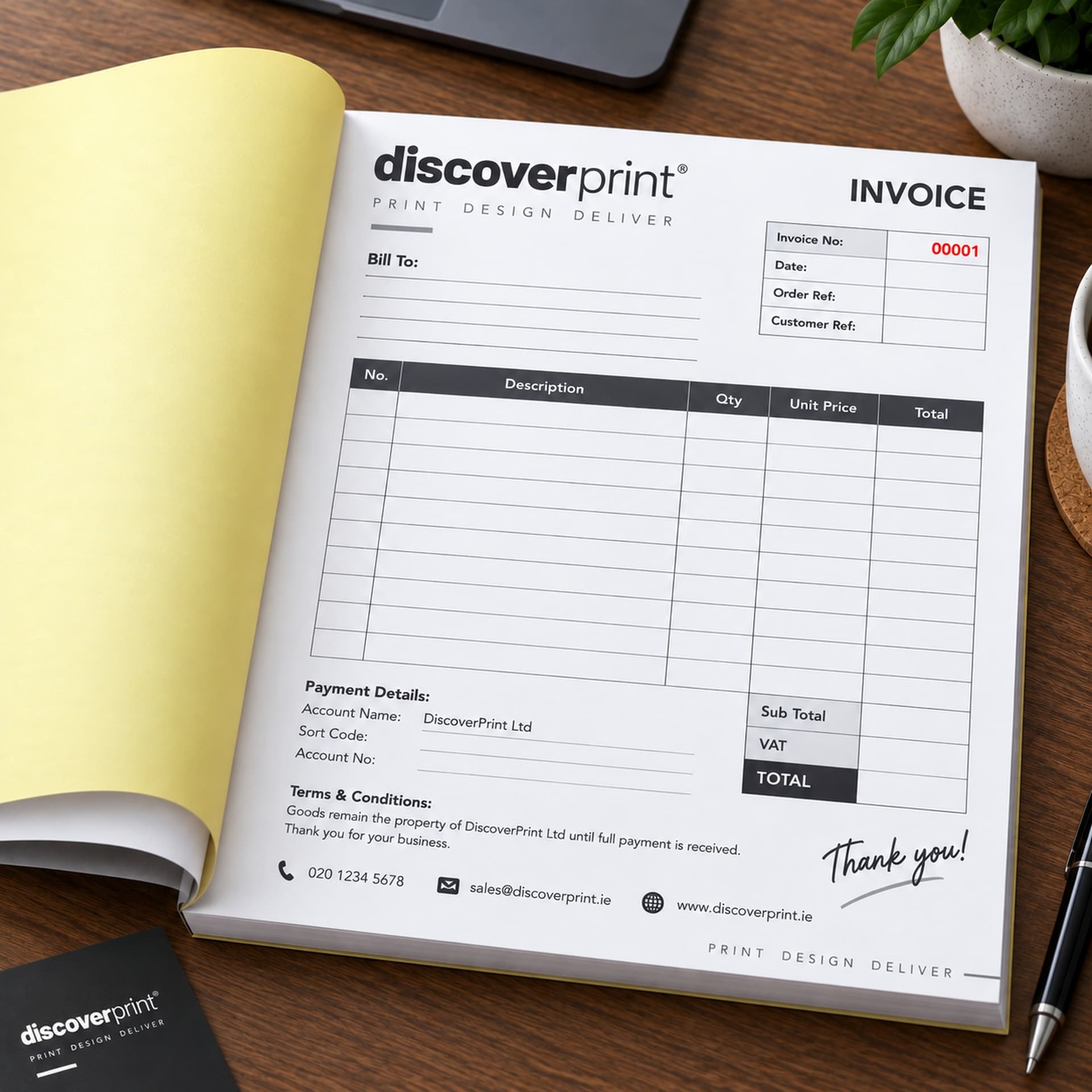
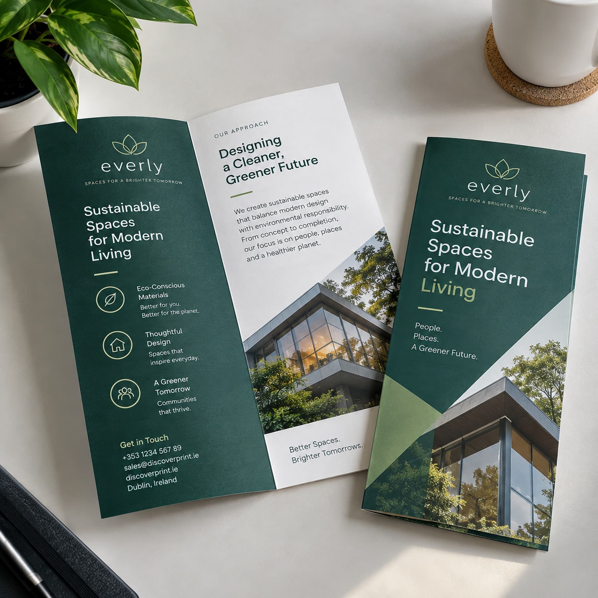
Consistency is not the same as repetition. Decide what the main colour is for and what the accent is for, and stick to it: main colour for headings and panels, accent for buttons and calls to action. When the same rule holds on your website, your business stationery and your pull-up banners, people recognise you before they read the name.
Legibility beats taste
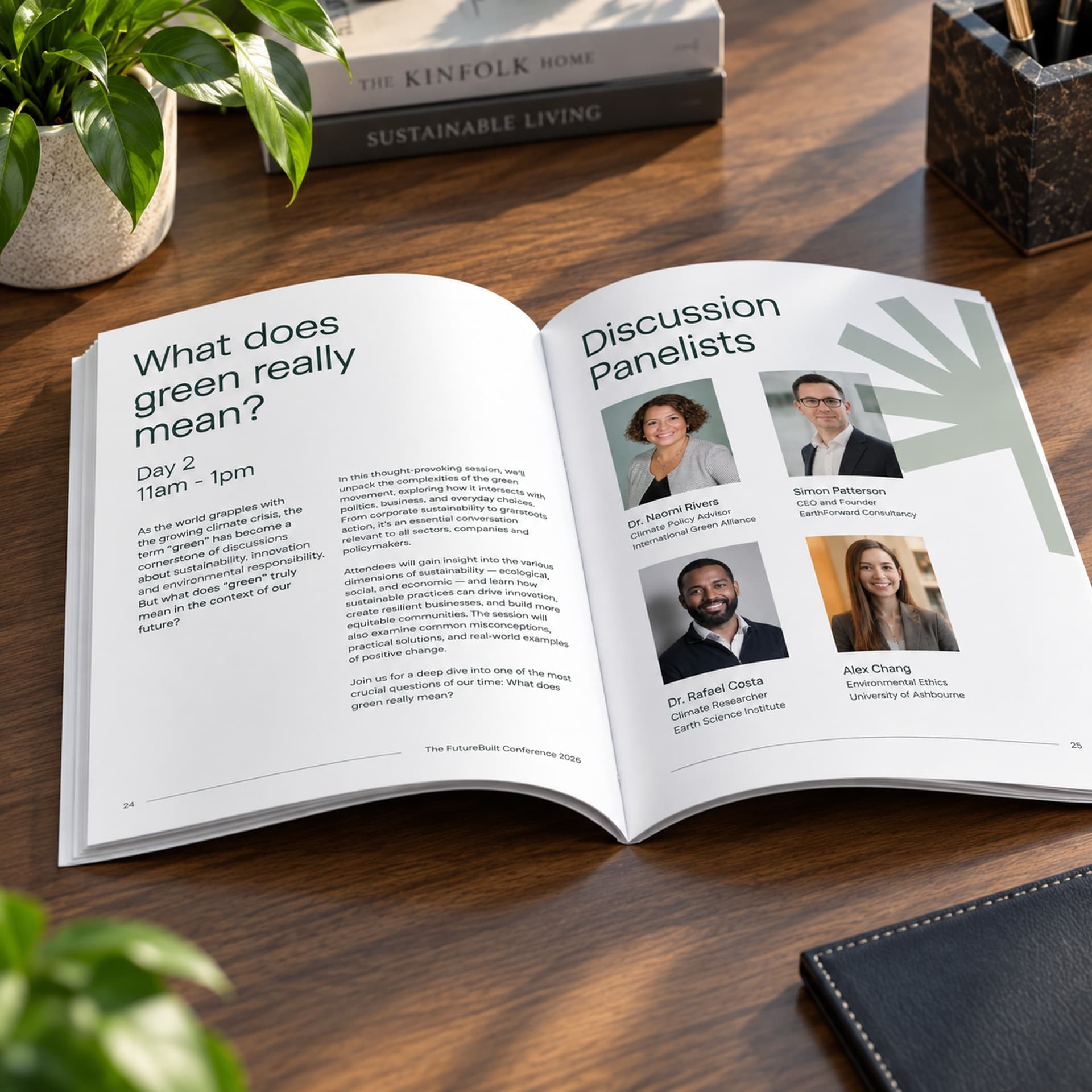
Dark text on a light ground, every time, for anything longer than a heading. Pale grey on white looks refined on a designer's screen and is unreadable on a leaflet in a hallway. If you take one rule from this, take that one.
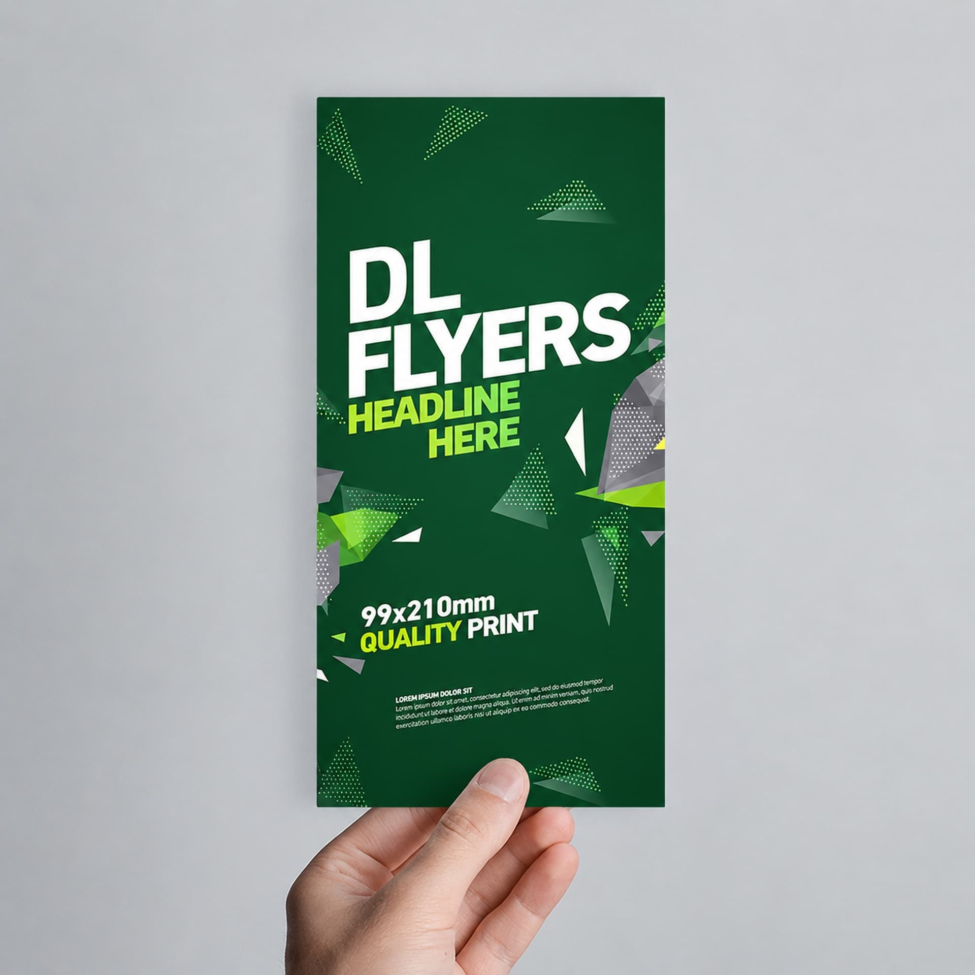
If you want to see how a colour behaves in ink before you commit the whole scheme to it, order something small and simple first. A run of DL compliment slips costs little and tells you more than any screen will.